Service businesses do not need flashy animations. They need clarity. A visitor should know within seconds what you offer, where you work, and how to take the next step—usually a call, form, or booking request.
User experience (UX) is simply the craft of making that path obvious. Here are patterns that consistently help contractors, clinics, consultants, logistics providers, and other service firms convert traffic into conversations.
Lead with the offer, not the company history
Your logo is not the product. Above the fold, state the service and the outcome. “Roof repair in Indian River County” beats “Welcome to our family-owned company” for first-time visitors who arrived from search with a problem to solve.
Support that headline with one primary call to action: Call now, Request a quote, or Schedule a consult. Secondary links—About, Blog, Careers—can wait until the visitor understands the offer. Many sites accidentally hide the phone number behind menus or tiny footer text; that is a UX failure disguised as design minimalism.
Design for thumbs first
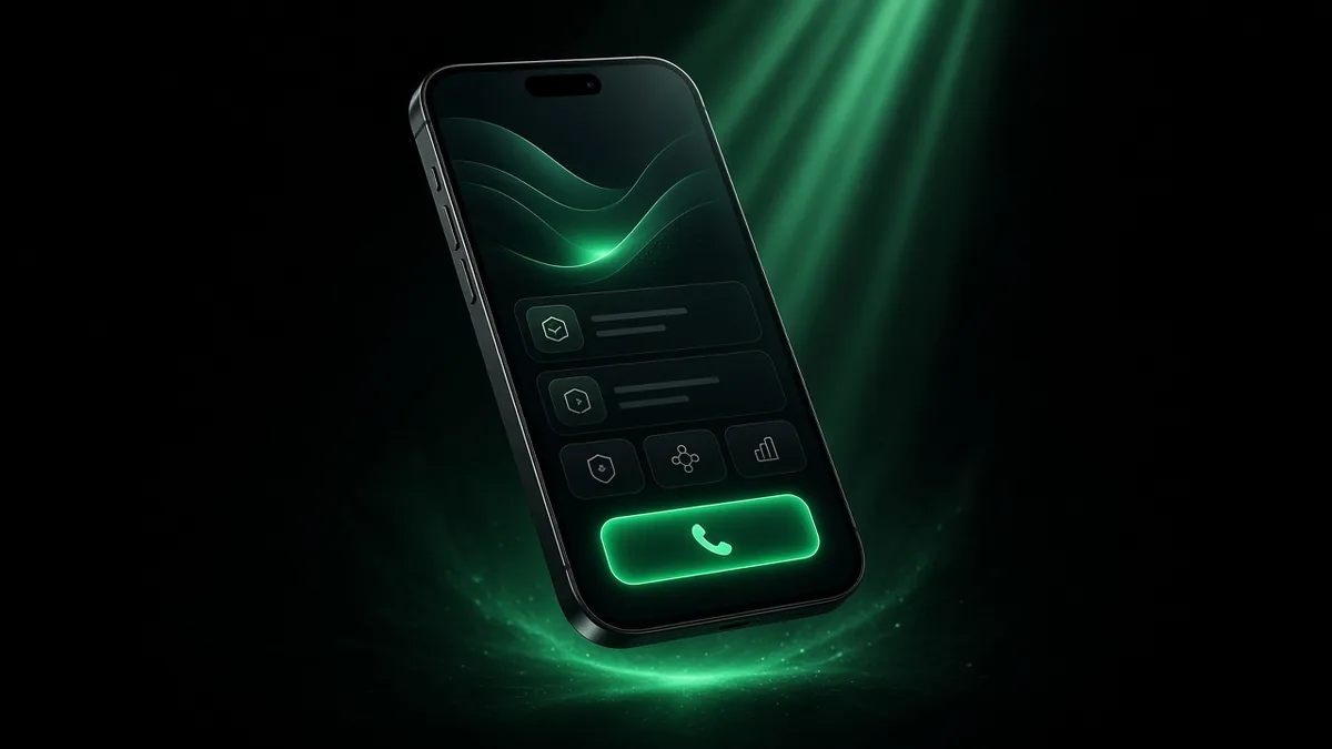
Google uses mobile-first indexing, and many local buyers are on phones between jobs. Tap targets should be large. Phone numbers should be click-to-call. Forms should ask only what you need to reply thoughtfully.
Responsive layout basics from web.dev remain essential: flexible grids, readable type, and images that do not break small screens. If your desktop site looks premium but mobile wraps buttons into unusable stacks, fix mobile before commissioning another homepage redesign.
Build trust without fake proof
Service buyers look for reasons to believe you will show up and do the work. Use real elements:
- Photos of actual work (with permission)
- Licenses, insurance, or association badges you truly hold
- Clear service areas and response expectations
- Process steps so people know what happens after they contact you
- Plain-language answers to objections (timelines, deposits, what you do not offer)
Do not invent testimonials or star ratings. If you do not have reviews yet, emphasize process, guarantees you can keep, and transparent communication. Empty five-star widgets are easy to spot and hard to live down.
Information architecture that matches how people buy
Most service journeys look like: problem → compare options → check credibility → contact. Your navigation should mirror that:
- Services (with child pages for major offers)
- About / why us
- Areas served (when local)
- Blog or resources
- Contact
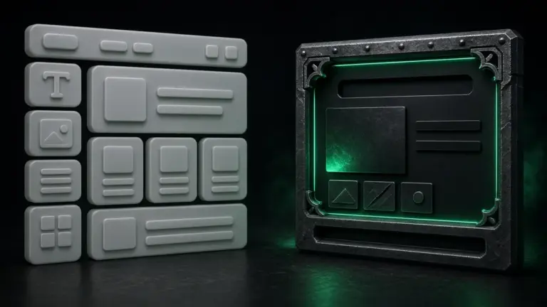
Avoid dumping every service onto one endless page unless the business truly has a single offer. Parallel structure across service pages helps visitors—and helps you maintain the site later in WordPress without hunting through mystery sections.
Forms that respect busy people
Long forms feel like homework. Ask for name, contact method, service needed, and optional details. Confirm submissions with a thank-you page that sets expectations for response time. Route notifications to an inbox someone actually monitors—including evenings if that is when leads arrive.
Accessibility is part of UX
Accessible sites help more customers—and often improve overall clarity for everyone. The W3C introduces why accessibility matters, and MDN explains what accessibility means in practice: semantic HTML, keyboard access, contrast, and meaningful labels.
For a service firm, that can be as concrete as readable contrast on buttons, form fields that screen readers can announce, and avoiding “click here” links that hide destination context.
Speed and visual stability support UX
If buttons jump while the page loads, people mis-tap. If the hero image takes forever, they leave. Pair UX work with performance habits covered in Core Web Vitals explained and hosting choices in edge hosting and CDNs.
Examples of service-focused structure
Niche service sites succeed when every page answers a searcher’s question. Studio examples include boattransportnearme.com and heavyequipmenttransportnearme.com—organized around jobs people are already trying to get done, with paths toward contact rather than decorative dead ends.
A quick UX audit you can run today
- Open your homepage on your phone: is the next step obvious in five seconds?
- Can you call with one tap without hunting?
- Does each service page explain who it is for and what happens next?
- Are there broken layout shifts when images load?
- Would a stranger know your service area and primary offer?
- Do popups block the very CTA you want people to use?
Write down the first three friction points you find. Fix those before debating new brand colors.
Ironcraft’s approach
We design WordPress sites for how service businesses actually sell—clear offers, mobile CTAs, and editable pages you can update after launch. Explore custom WordPress and SEO services, meet the studio, or see how AI-assisted production keeps custom UX within reach.
UX FAQs for service company sites
How many calls to action should a page have?
One primary action per viewport is a reliable rule. You can repeat that same action—call or quote—as people scroll, but competing “Buy now,” “Download,” and “Subscribe” buttons on a service page dilute attention.
Are chat widgets good UX?
They can be, when they load late, stay out of the way of click-to-call, and answer approved FAQs. They become bad UX when they auto-open, block forms, or invent answers. See AI chat and lead tools for a careful rollout.
Should every page look unique?
Visual variety helps, but shared patterns help visitors learn your site. Keep headers, CTA styles, and form layouts consistent so people spend attention on your offer—not on relearning the interface.
Let’s make your site easier to say yes to
Ironcraft Studio in Sebastian, FL helps Treasure Coast and nationwide service companies turn traffic into inquiries.
Contact us to review your UX priorities. Call 772-588-4413 or email projects@ironcraftstudio.com.